Happy Birthday, Dad!
Saturday, June 27, 2015
Happy birthday, Dad! 65 today! Looking forward to celebrating with you! xx

Linked Album |
 | Posted by Danica Scott at 07:10 |
| comments 1 |
Happy Birthday Mum!
Thursday, June 25, 2015
This is just a quick note to wish mum a very happy 60th birthday. We're sorry we can't be there to spend the day with you but hope you enjoyed last weekend and have a great time at the seaside

 | Posted by Ben Taylor at 07:03 |
| comments 1 |
Mobile Image swipe in FancyBox 2
Sunday, June 7, 2015
Having added some media queries to make the site more mobile friendly, it very quickly came to my attention that the fancy new gallery was not mobile friendly. After a quick google I found the the same question had been published on stackoverflow.
All that was required was copying the following into the _setDimenion function
$(F.outer).on('swipeleft', function() {
F.next();
});
$(F.outer).on('swiperight', function() {
F.prev();
});
and then the following two JQuery plugins need to be included in your code
plugins.jquery.com/event.move/
plugins.jquery.com/event.swipe/
Simple!
It looks like the new fancybox 3 beta version natively supports swipe - but hey ho!
See More: #programming |
| Posted by Ben Taylor at 21:44 |
| comments 0 |
Customising FancyBox 2 with comments
Sunday, June 7, 2015
A couple of weeks ago I gave the existing hand coded lightbox an overhaul and replaced it with the much better looking JQuery FancyBox 2 plugin fancyapps.com/fancybox/. It was very quick and easy to set up and was soon working. It wasn't long however before I started tinkering. Previously I had a comments section in place, and it wasn't clear how to make this work with the new fancybox set up. I had a look around on the Internet and found a few implementations that customised the title section for each photo, but this wasn't quite what I wanted. In the end I decided on a custom comments box to the right of the screen (You can see this in action by browsing any of the photo albums).
The first job was actually getting a box on the right side of the screen. This turned out to be a little more challenging than first anticipated. In the end, it was achieved by specifiying a margin in the fancybox options, and then using the aftershow callback to populate the comments. I've included the code below for those that are interested:
$('.fancybox').attr('rel', 'gallery').fancybox({
margin: [20, 300, 20, 20],
afterShow: function(){
var commentsContainer = "<div class='lightboxcomments'></div>";
if ($(document).find('.lightboxcomments').length == 0) {
$('.fancybox-overlay').append(commentsContainer);
}
//CODE GOES HERE TO POPULATE COMMENTS
}
});
Each time it loads a new photo, it checks to see if the comment div exists and if not, it adds it to the DOM. It then uses a JQuery getJSON() call with a callback to populate the comments when loaded from the database. I'm sure there are probably better / more efficient ways to achieve the same thing, but it does the job well for now.
| Posted by Ben Taylor at 21:17 |
| comments 0 |
CSS Queries: A step towards responsiveness
Friday, June 5, 2015
So I thought it was about time mybigadventures became a bit more mobile. When I recently re-designed the site I didn't think much about making everything work on smaller devices and having checked the website on my mobile this was pretty clear. The site looks great on my laptop where it has mostly been viewed but on smaller devices the text is too small and thtere's just too much going on. I didn't really want to start from scratch and make a mobile site so I went for a much faster and simpler solution using CSS media queries.
If you haven't used CSS queries before they're essentially a set of rules that you can add to the CSS to control when certain CSS styles should be applied. What this means in practice is that you can add media queries to test the width of the browser used to view your site and change the size of your content accordingly. In my case, to make the site more mobile friendly, at certain page widths I hide some of the content and increase the font size. The code looks a bit like this:
@media (max-width: 1199px) {
p {
font-size:140%;
}
}
All this will do is if the browser width is less than 1200 pixels, it will increase the font size by an additional 40%. Simple! You can see this in practice if you're viewing the site using a destop or laptop computer. Just resize the browser window to make it smaller and watch the layout change. The downside of course is that because some of the content is simply hidden, it doesn't stop the device you're using from downloading it (so you're downloading content you'll never see). It also currently means that some of the content that enables you to interact with the website is currently unavailable (viewing anything other than the most current blog, logging in, adding comments).
It's certainly far from perfect but it'll do the job for now.
See More: #programming #website |
| Posted by Ben Taylor at 21:55 |
| comments 0 |
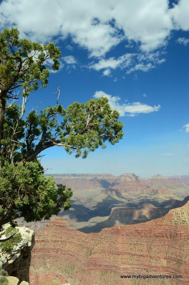
American Adventure - New Photos
Tuesday, June 2, 2015
So a couple of years ago we went on a big summer holiday to America. Having been teachers for a while we thought it was about time we made good use of the holiday before they eventually take it off us, and so we headed off to America for 4 and a half weeks. Unfortunately the website was not up and running at that time, and so we weren't able to document the trip on here. Now that everything is running fairly smoothly and to celebrate a brand new shiny gallery, I've added some more photos. There's quite a few, organised into the different cities that we visited during the trip to please have a browse. Sign up, leave some comments and let us know what you think.

For those interested in the new gallery - its powered using the FanscyBox 2 JQuery library. It was pretty straight forward to add in, although there was a fair bit of head scratching involved to get the photo comments back up alongside images. I'm pretty happy with the results though. Enjoy the photos
Linked Album |
See More: #updates #America2013 |
| Posted by Ben Taylor at 20:24 |
| comments 2 |