Content Matching: Programming
Google Maps API
Sunday, July 22, 2018
The summer holiday has arrived after another long year, and what better time for a few website upgrades! When I first put the website together back in 2007, I created a map with markers making the path of our intended journey around Europe and had it linkefrom the homepage. I think I made it using one of the early versions of the Google Maps API, and it didn't take long for things to move on and the old map to become redundant. It's been over 10 years, but I started haviing a look at putting some geo-tagging functionality in for mapping out the places we've visited.
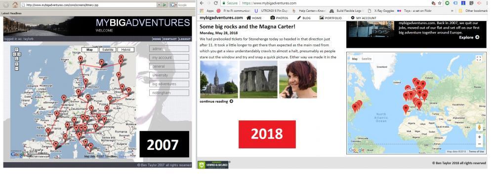
After a bit of tinkering I've now added geo-tagging for the albums and may look at adding it to photos and blogs in the near future. I've tagged quite a few albums to try it out and everything seems to be working. You should now see a map on the homepage with markers for the places we've visited, and small maps in the sidebar for albums that have been tagged. If I get a chance, I'll tidy up the user-interface a bit and make it a little fancier with links to albums when you click the markers. Let me know if you find any bugs!
 | Posted by Ben Taylor at 16:15 |
| comments 0 |
Optimising Images
Saturday, January 7, 2017
I've just been tweaking the site a little more as I was experiencing a few issues with load speeds on photos. I've made a couple of changes that will hopefully speed things up. To start with I've added a new optimised image size. Essentially when you first visit one of the pages, a bit of code grabs your screen size and saves it into the session. Assuming I've captured your screensize, each time you load a full size image, nested in a blog entry or by clicking album image, the website will decide if it's worth while loading the larger image or if it can show you a reduced resolution. So it basically now means for each album image I store at least 3 copies of it, one full size, one reduced resolution (1000px max dimension) and one higher resolution (2000px max dimensions). If you're viewing album thumbnails for example, the site will serve up the thumbnail images which speeds up download for you. If you're looking at a large image in an album, that will either be the 1000px or 2000px image - depending on your screen resolution.
The image below should resize dynamically depending on your resolution. If you right click it and open image in a new tab, the majority of you should see a 1000px wide image, however, if you're running a resolution higher than 1500px wide you should get the much larger, slower to download 2000px image.
I've also tweaked the image loading on the PHP side of things, I was previously loading images into memory using imagecreatefromjpeg in PHP. It turns out that this was a bit of a hog on memory for the site and also led to a much slower load for end users. It now does a simple redirect if possible to static files, which again should improve things.
Hopefully you'll see a difference when browsing though the site. Let me know in the comments if you experience any load issues.
See More: #programming #updates |
| Posted by Ben Taylor at 13:05 |
| comments 0 |
Introducing Album Comments
Saturday, July 9, 2016
I've just been making a few tweaks before we take our trip and decided to add in a new feature - album comments. It seemed like a big job until a few recent changes that made it all possible so there you go. You can now add comments to blogs, albums and individual photos. The new comment link appears only on albums containing photo's and can be found under the album cover and summary which appears on the right of the screen.
I've also added a few icons to give the site a bit of a facelift. If anyone's interested I'm using the fontawesome font set to generate the icons. Its really straightforward to use and there's lots of icons to choose from. I've got quite addicted and added them all over the place, many of which only Dani and I will ever see! That's all for now, let me know if you have any issues.
| Posted by Ben Taylor at 22:07 |
| comments 0 |
Going Social
Saturday, June 18, 2016
After finally adding the forgotten details page, it got me thinking about what else to improve. I started to look at the social networking side of things. There's been a few facebook sharing links around on the site for a while, but there's always been issues with them displaying correctly. Facebook uses a system called open graph which provides a bit of structure to the content you share. The open graph system relies on meta data on the website - for those that don't know, meta data is basically data about data. The meta data in this case, provides additional information about the thing you are trying to share. So after a bit of an update and lots of checking on the facebook scraper, blog posts and photo albums can now be shared from the site, and should provide some contextual information related to where you are clicking the share button. It's certainly not perfect right now, but it works! To complement this wonderful new sharing functionality I've also added some fancy new buttons with a little help from sharingbuttons.io/. That's about all for now, in the mean time, go mad, share something!
See More: #updates #programming |
| Posted by Ben Taylor at 23:12 |
| comments 0 |
Mobile Image swipe in FancyBox 2
Sunday, June 7, 2015
Having added some media queries to make the site more mobile friendly, it very quickly came to my attention that the fancy new gallery was not mobile friendly. After a quick google I found the the same question had been published on stackoverflow.
All that was required was copying the following into the _setDimenion function
$(F.outer).on('swipeleft', function() {
F.next();
});
$(F.outer).on('swiperight', function() {
F.prev();
});
and then the following two JQuery plugins need to be included in your code
plugins.jquery.com/event.move/
plugins.jquery.com/event.swipe/
Simple!
It looks like the new fancybox 3 beta version natively supports swipe - but hey ho!
See More: #programming |
| Posted by Ben Taylor at 21:44 |
| comments 0 |
Customising FancyBox 2 with comments
Sunday, June 7, 2015
A couple of weeks ago I gave the existing hand coded lightbox an overhaul and replaced it with the much better looking JQuery FancyBox 2 plugin fancyapps.com/fancybox/. It was very quick and easy to set up and was soon working. It wasn't long however before I started tinkering. Previously I had a comments section in place, and it wasn't clear how to make this work with the new fancybox set up. I had a look around on the Internet and found a few implementations that customised the title section for each photo, but this wasn't quite what I wanted. In the end I decided on a custom comments box to the right of the screen (You can see this in action by browsing any of the photo albums).
The first job was actually getting a box on the right side of the screen. This turned out to be a little more challenging than first anticipated. In the end, it was achieved by specifiying a margin in the fancybox options, and then using the aftershow callback to populate the comments. I've included the code below for those that are interested:
$('.fancybox').attr('rel', 'gallery').fancybox({
margin: [20, 300, 20, 20],
afterShow: function(){
var commentsContainer = "<div class='lightboxcomments'></div>";
if ($(document).find('.lightboxcomments').length == 0) {
$('.fancybox-overlay').append(commentsContainer);
}
//CODE GOES HERE TO POPULATE COMMENTS
}
});
Each time it loads a new photo, it checks to see if the comment div exists and if not, it adds it to the DOM. It then uses a JQuery getJSON() call with a callback to populate the comments when loaded from the database. I'm sure there are probably better / more efficient ways to achieve the same thing, but it does the job well for now.
| Posted by Ben Taylor at 21:17 |
| comments 0 |
CSS Queries: A step towards responsiveness
Friday, June 5, 2015
So I thought it was about time mybigadventures became a bit more mobile. When I recently re-designed the site I didn't think much about making everything work on smaller devices and having checked the website on my mobile this was pretty clear. The site looks great on my laptop where it has mostly been viewed but on smaller devices the text is too small and thtere's just too much going on. I didn't really want to start from scratch and make a mobile site so I went for a much faster and simpler solution using CSS media queries.
If you haven't used CSS queries before they're essentially a set of rules that you can add to the CSS to control when certain CSS styles should be applied. What this means in practice is that you can add media queries to test the width of the browser used to view your site and change the size of your content accordingly. In my case, to make the site more mobile friendly, at certain page widths I hide some of the content and increase the font size. The code looks a bit like this:
@media (max-width: 1199px) {
p {
font-size:140%;
}
}
All this will do is if the browser width is less than 1200 pixels, it will increase the font size by an additional 40%. Simple! You can see this in practice if you're viewing the site using a destop or laptop computer. Just resize the browser window to make it smaller and watch the layout change. The downside of course is that because some of the content is simply hidden, it doesn't stop the device you're using from downloading it (so you're downloading content you'll never see). It also currently means that some of the content that enables you to interact with the website is currently unavailable (viewing anything other than the most current blog, logging in, adding comments).
It's certainly far from perfect but it'll do the job for now.
See More: #programming #website |
| Posted by Ben Taylor at 21:55 |
| comments 0 |
Success!
Saturday, May 23, 2015
One site down, a few more to go! I still have the word press sites to tackle but I've got this one moved across. It went relatively smoothly with just a couple of small bumps in the road. As it's a new hosting account it also comes with the GoDaddy CPanel to set everything up. Having backed the database up, it was a fairly simple to upload the script which then happily recreated everything again. The only step I missed was assigning my new database user to the database itself so I was hitting loads of database errors for a while. GoDaddy support were pretty awesome though and had it fixed within a couple of minutes.
My final error is an odd one. I've been happily writing blogs for the last couple of months with apostrophe's in titles and blogs but when it came to trying to save this very blog, the first time around, I found that anything with an apostrophe in wouldn't save. At first I thought the JavaScript was to blame but it turned out to be a problem in the PHP. I've no idea how it worked before, but all that was required was to escape my sql string paramters e.g:
$text = "it's going to be a wonderful day";
$text = $mysqli->real_escape_string($text);
As I say, I'm not sure how or why this worked before, and not now, as the only thing that changed in the code was the MySQL connection string. I assume it must be down to a version change in PHP or MySQL on the hosting account. Either way - happy days - we're back!
See More: #programming #website |
| Posted by Ben Taylor at 11:23 |
| comments 0 |
Simple JQuery Image Slideshow
Wednesday, May 20, 2015
So I had a few images lined up for the header and couldn't quite decide which one should make the cut. I've given each of them a run over the past few weeks and as you can see above, I've decided to give them all a go at once. I've seen a lot of these fading image galleries around on the Internet - theyre often used to display current offers on sites like ebuyer. After a quick browse around the Internet I found what I was after at css-tricks.com/examples/SimpleSlideshow/. It was nice and easy to customise for this site and thought I'd share it a bit wider for anyone looking to do the same thing.
You basically store the images in a div and then Jquery cycles around fading the current image out and the next one in whilst keeping unused images hidden. To set up start by adding the HTML for your images. I've included a sample below, but you can add as many image divs as you want.
<div id="slideshow">
<div>
<img src="image1.jpg"/>
</div>
<div>
<img src="image2.jpg"/>
</div>
</div>
Then you just need a bit of CSS to style it
<style>
#slideshow > div {
position: absolute;
}
</style>
Finally you just add the jquery code to add the animation. You'll need to include the JQuery library - you can include locally or from ajax.googleapis.com/ajax/libs/jquery/1.5.2/jquery.min.js. Then add the following code to the page:
$(document).ready(function() {
$("#slideshow > div:gt(0)").hide();
setInterval(function() {
$('#slideshow > div:first')
.fadeOut(1000)
.next()
.fadeIn(1000)
.end()
.appendTo('#slideshow');
}, 10000);
});
I haven't decided if I love it yet. I think I might tweak the timing a bit more to reduce the frequency of changes. In other news it's nearly half term!
See More: #programming #website |
| Posted by Ben Taylor at 21:14 |
| comments 0 |
updating the .htaccess file
Wednesday, April 29, 2015
I had looked at a few other blog type sites and decided I wanted to simplify the URLs for the website. After a quick read around on the Internet I came across Apache mod rewrite for the .htaccess file. Now that's more than likely meaningless to anyone that might look at the site and up until very recently didn't mean a lot to me either. After having a looking on a couple of different websites, it seemed to achieve what I was looking for with very little effort.
To begin with I had to create a .htaccess file in notepad as there wasn't one in the root directory of my hosting account.
I started by adding:
Options +FollowSymLinks -Multiviews
This enabled mod rewrite on my hosting account with godaddy
I then started by removing the requirement for .php at the end of my php pages. I copied and pasted the code for this from a site I came across:
RewriteEngine On
RewriteBase /
RewriteCond %{REQUEST_FILENAME}.php -f
RewriteRule ^ %{REQUEST_URI}.php [L]
I then added a few custom rewrites to simplify access of the blog and album elements of the website. Having very little experience of mod rewrite I was really pleased to find an automated tool in the shape of www.generateit.net/mod-rewrite/index.php.
That's pretty much it, now I have super simple URLs instead of those long php parameterised ones that I had before!
See More: #programming #website |
| Posted by Ben Taylor at 20:30 |
| comments 0 |